

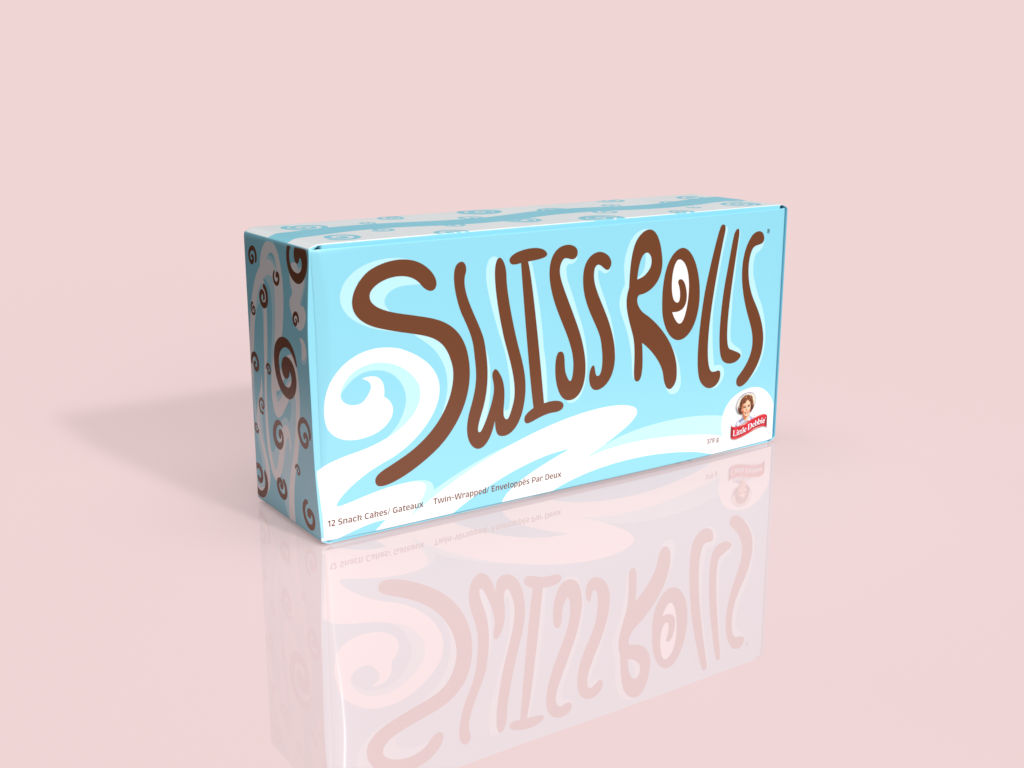
The Brief
In our second year of Illustration, we were given a packaging rebrand project where we would choose a product found at a grocery store and freshen up its visuals while still respecting the company message, public, and state of mind.
I ended up choosing Little Debbie's Swiss Rolls, a personally nostalgic classic treat. As a kid the only time I would ever be able to get my hands on Swiss Rolls would be when we go camping during the summer, so its packaging held a very distinct place in my mind associated with excitement and fun memories. With this project, I wanted to update the iconic package and featured motifs while still keeping its recognizable color palette.
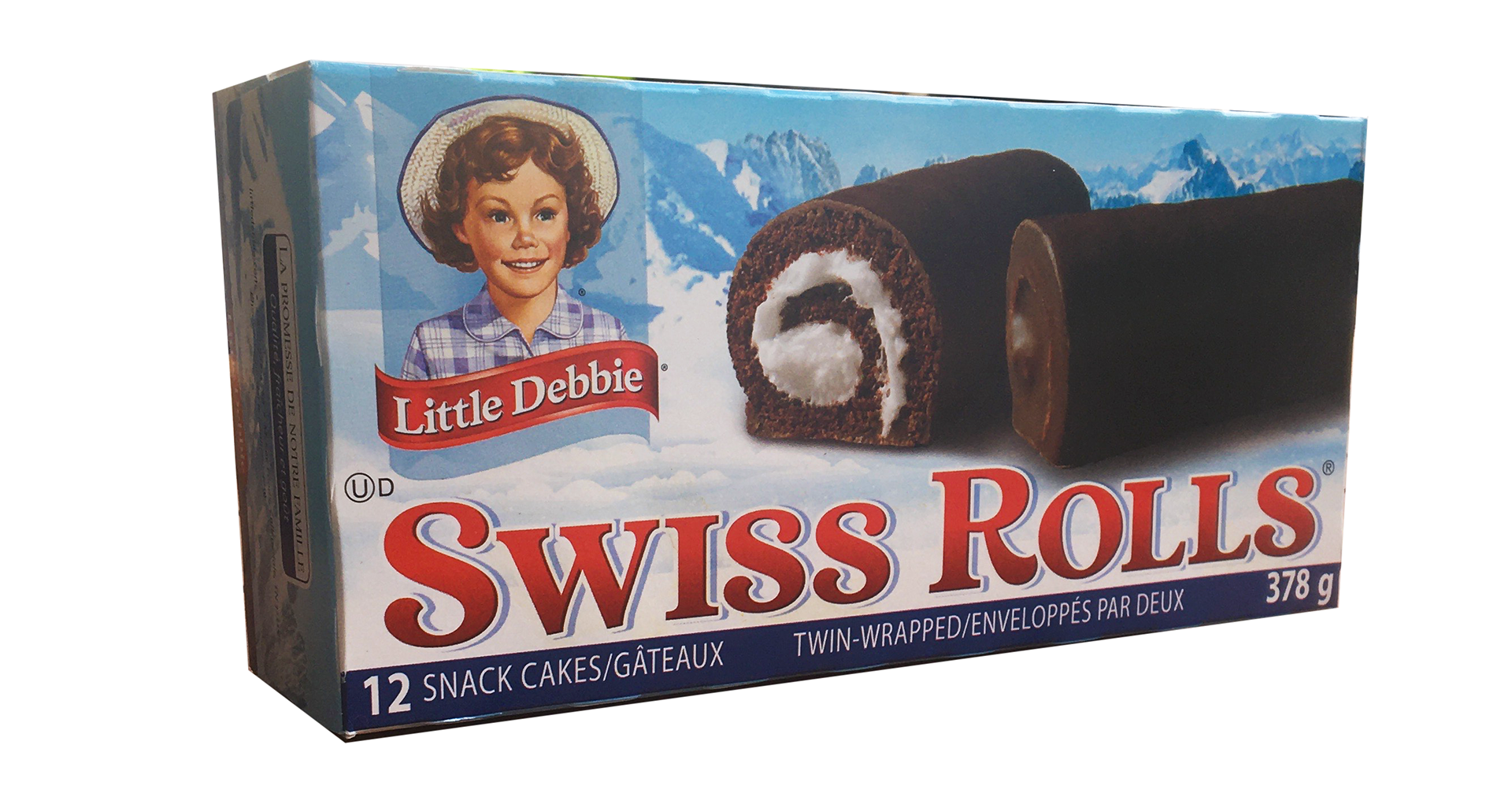
Original Package
Mindmap and early exploration sketches
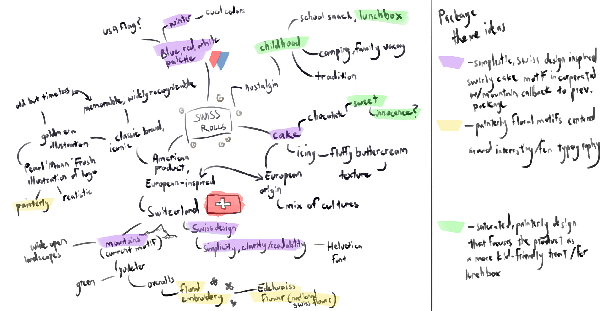
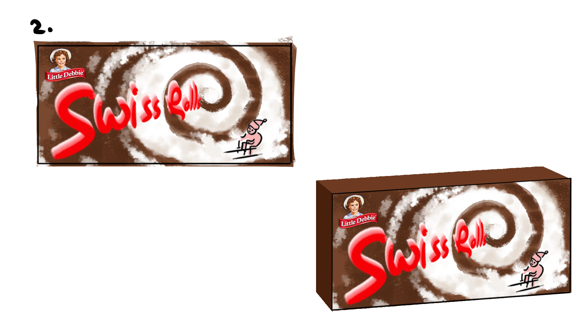
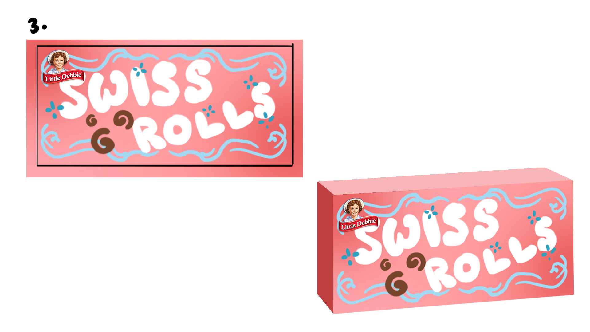
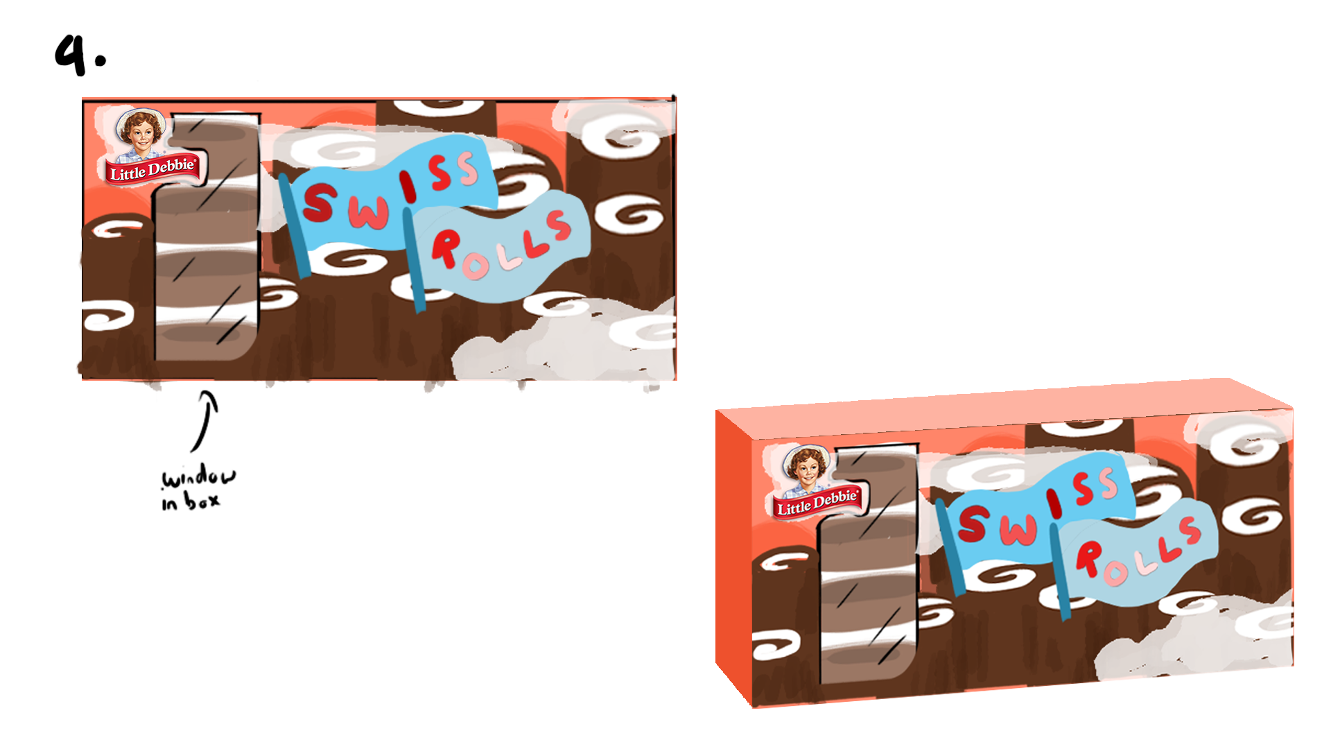
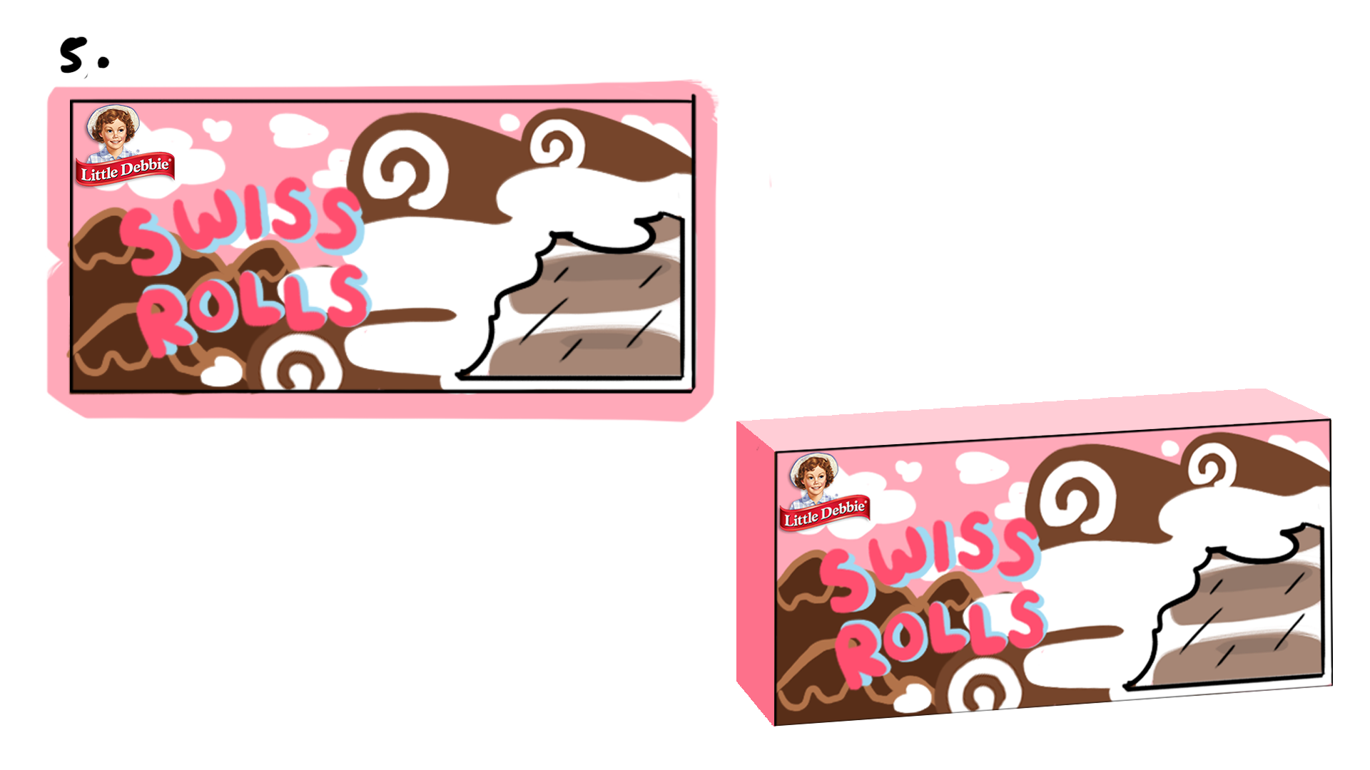
Somewhere along the way, I got really attached to the idea of integrating a small window cutout on the front of the box. After showing the initial sketches to my professor, she pointed out that with the type of prewrapped product that Swiss Rolls are, it would sort of be redundant to add in the window.
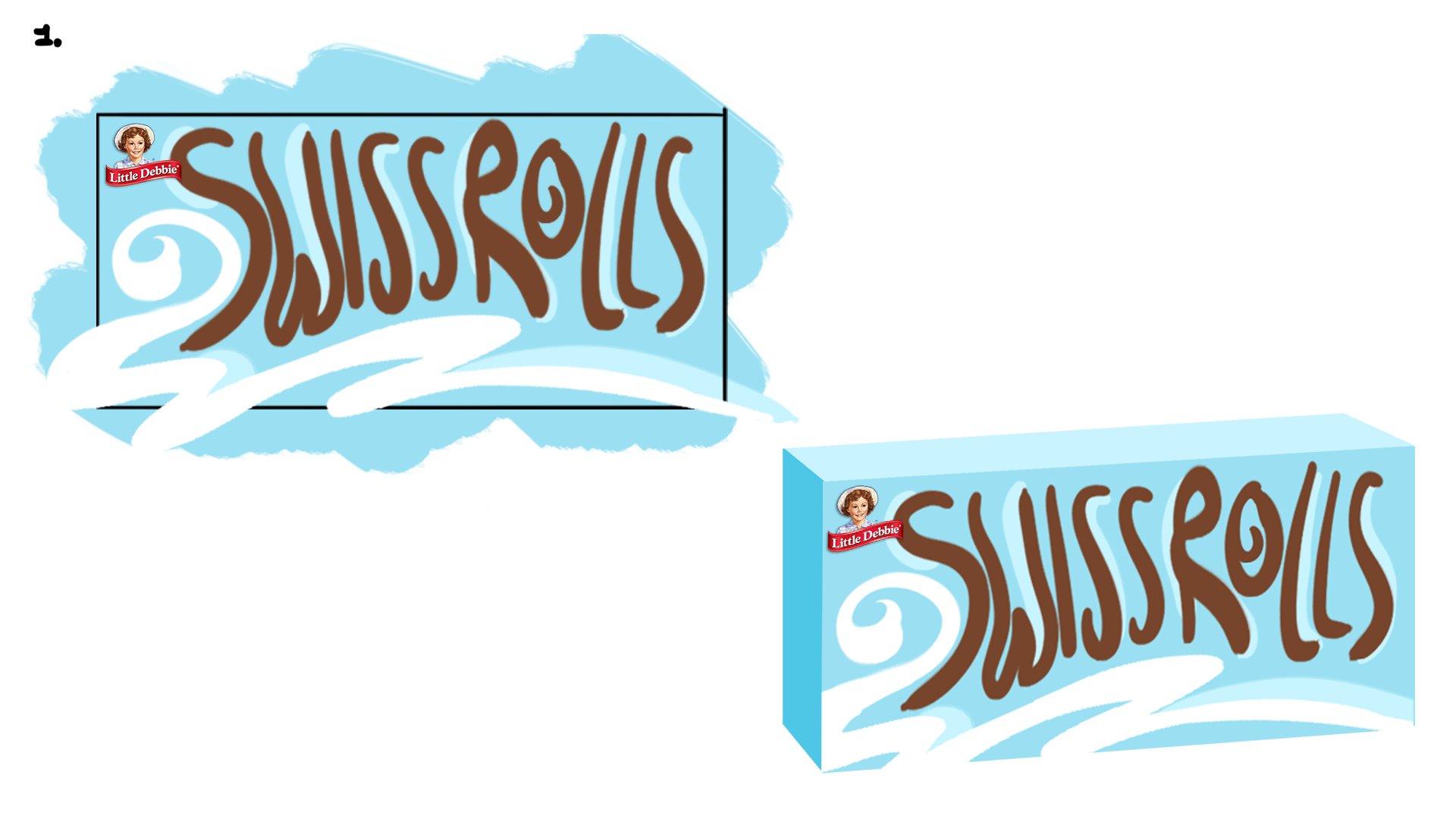
Instead of trying to completely erase the old look of the packaging, we decided that it would be best to go with my first sketch. It kept the original color palette and gave the lettering a more dynamic feeling that felt playful and universally appealing for all ages.
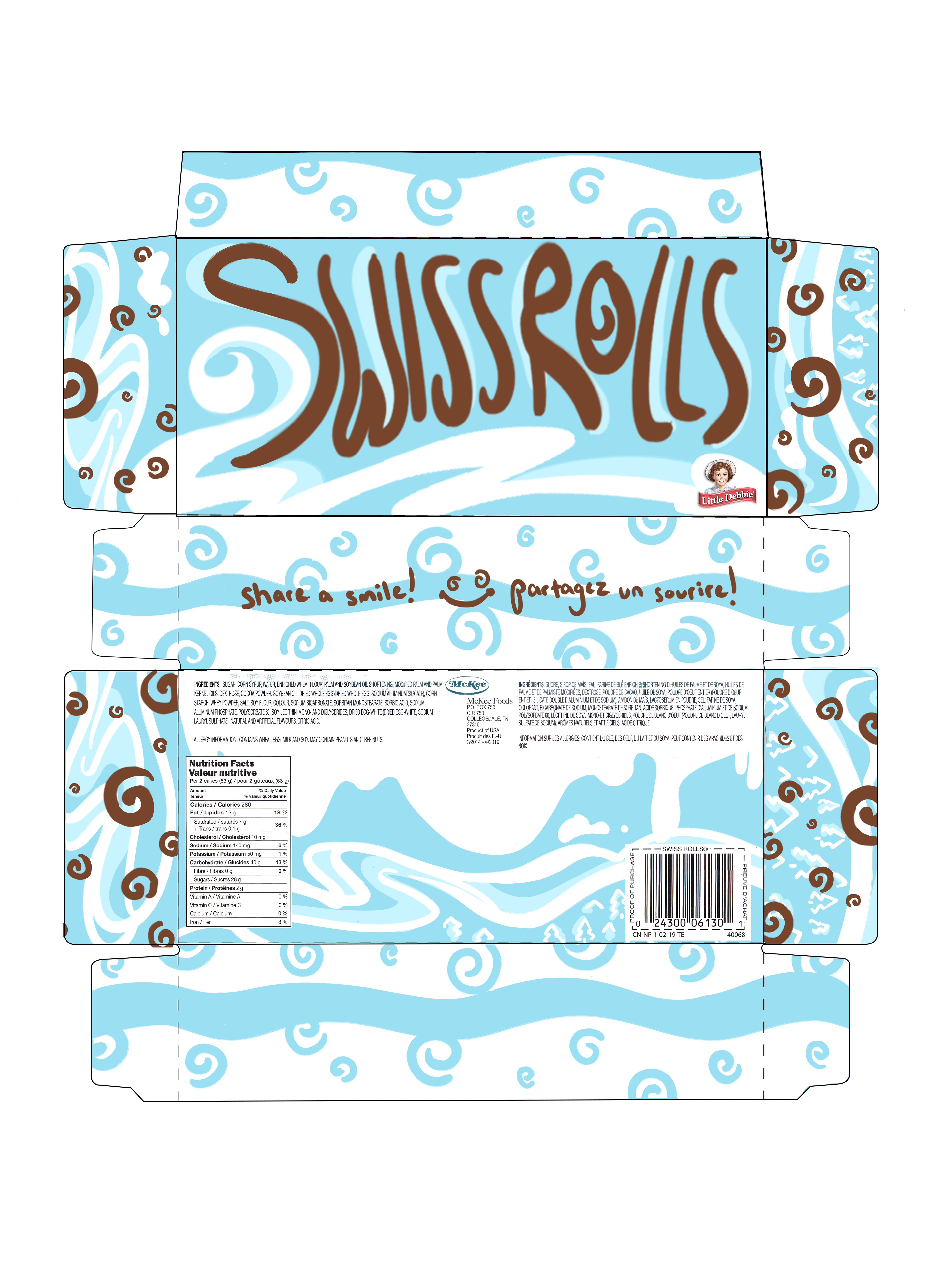
Revised sketch for entire box design with chosen concept
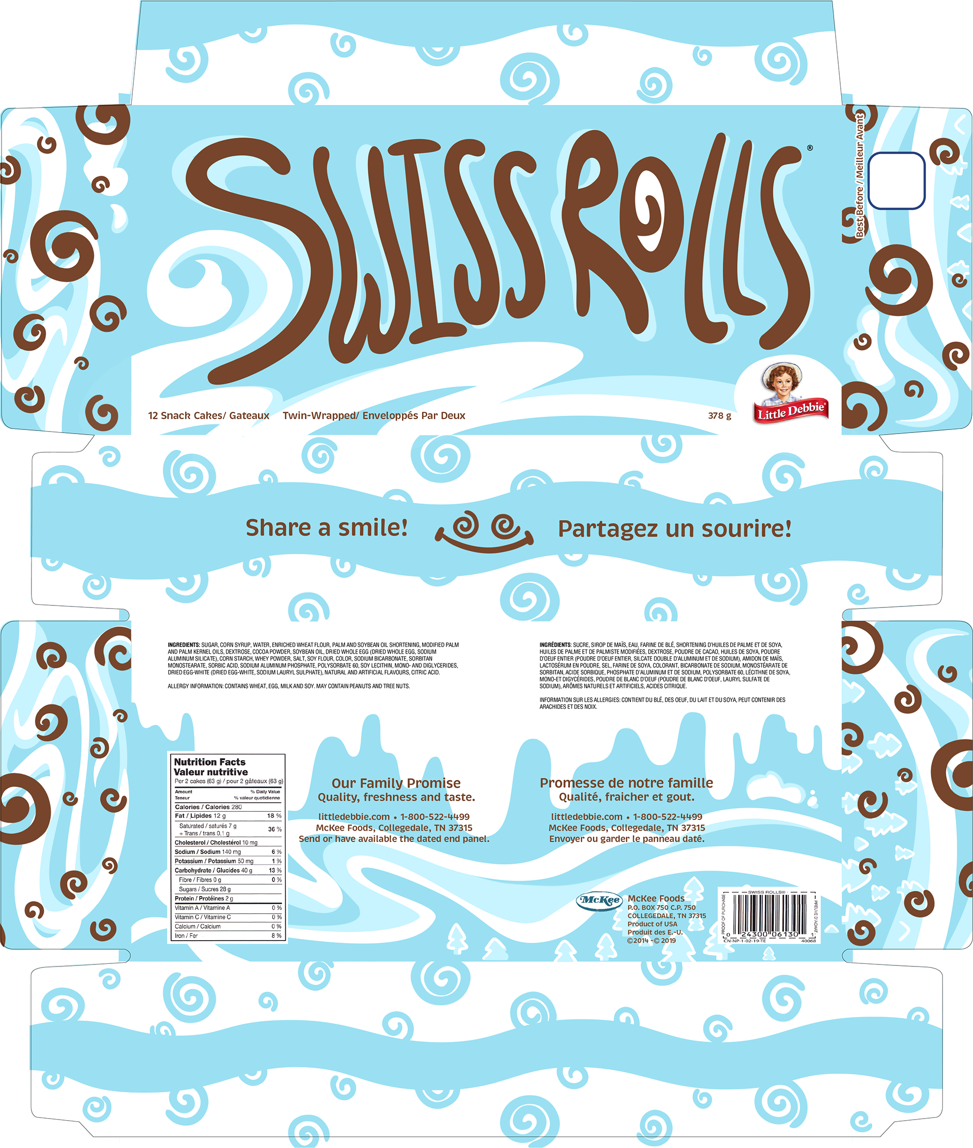
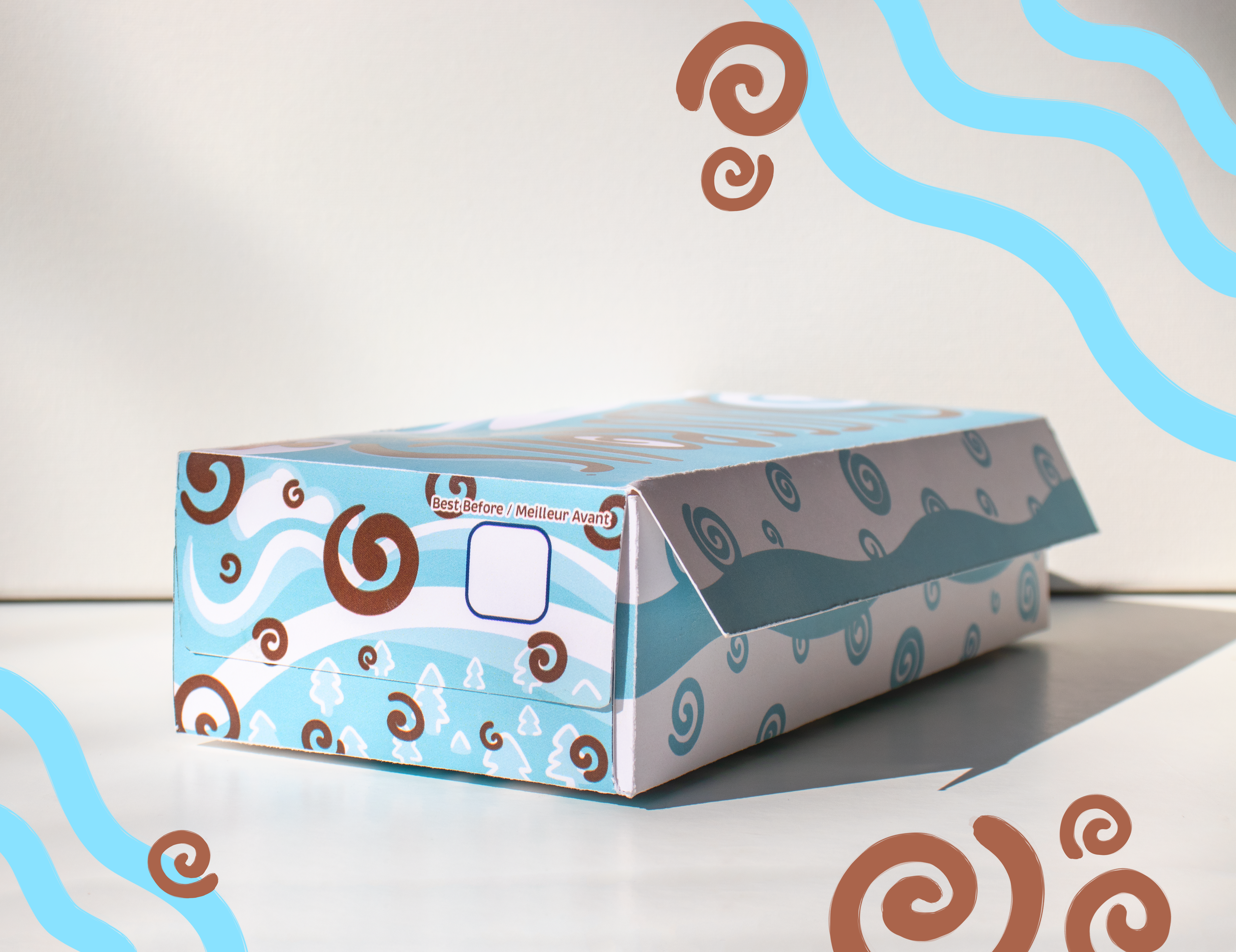
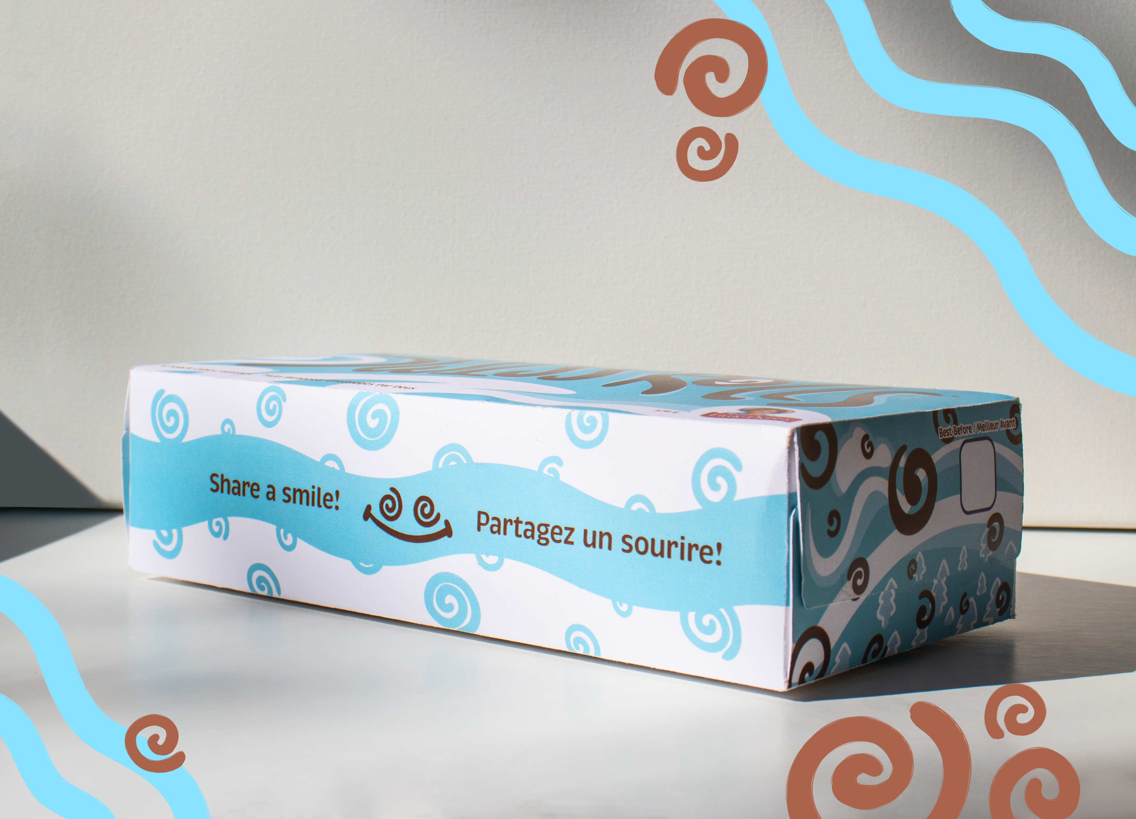
Final box design and physical mockup
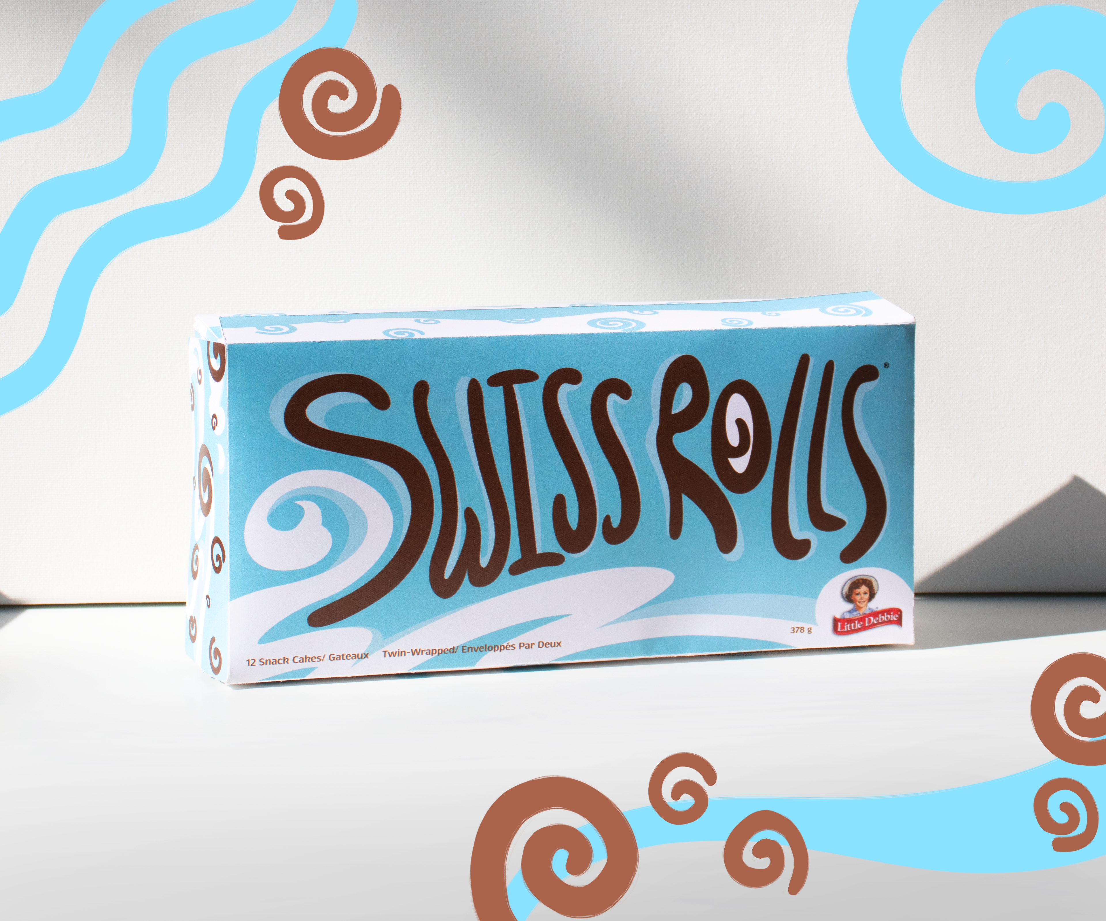
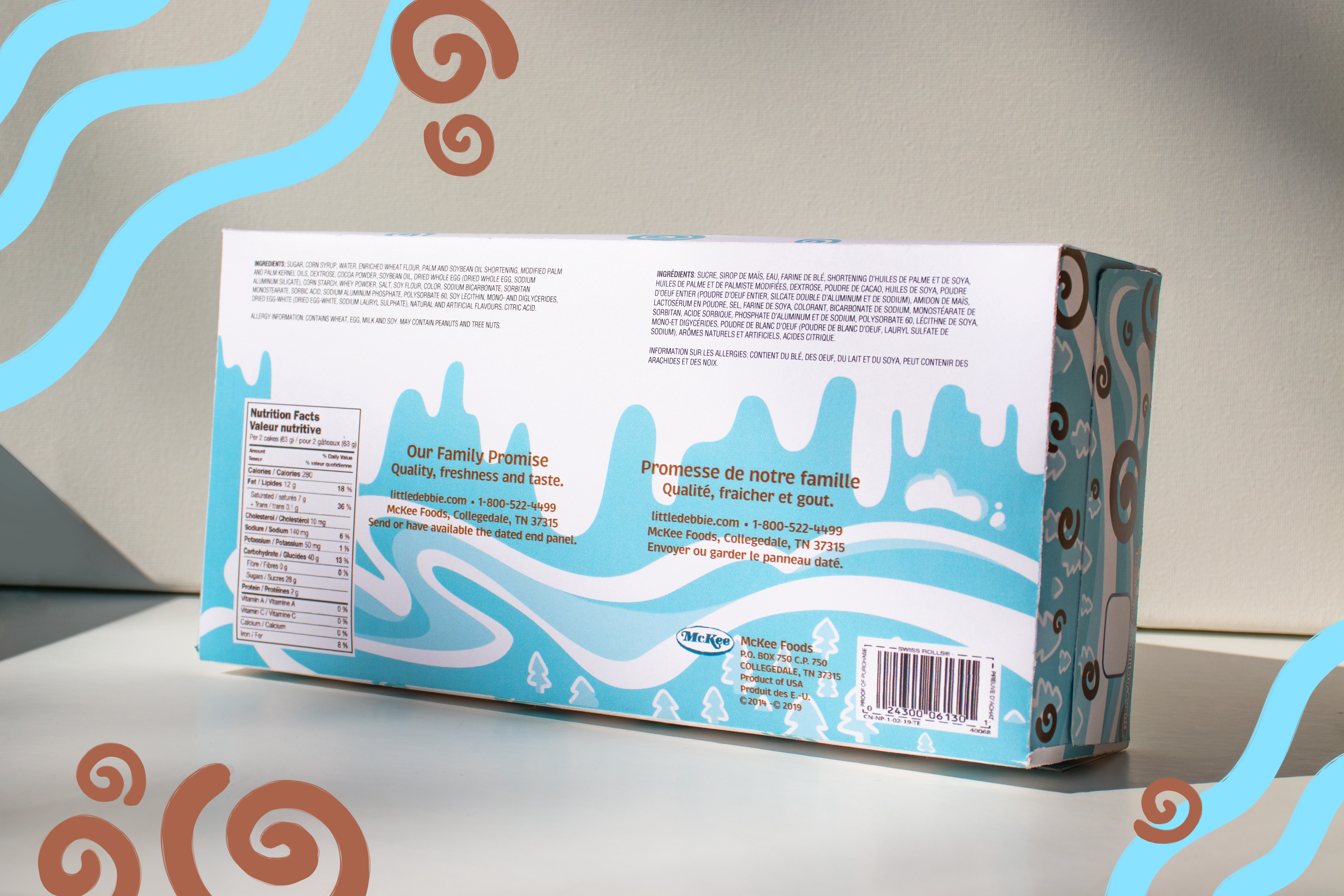
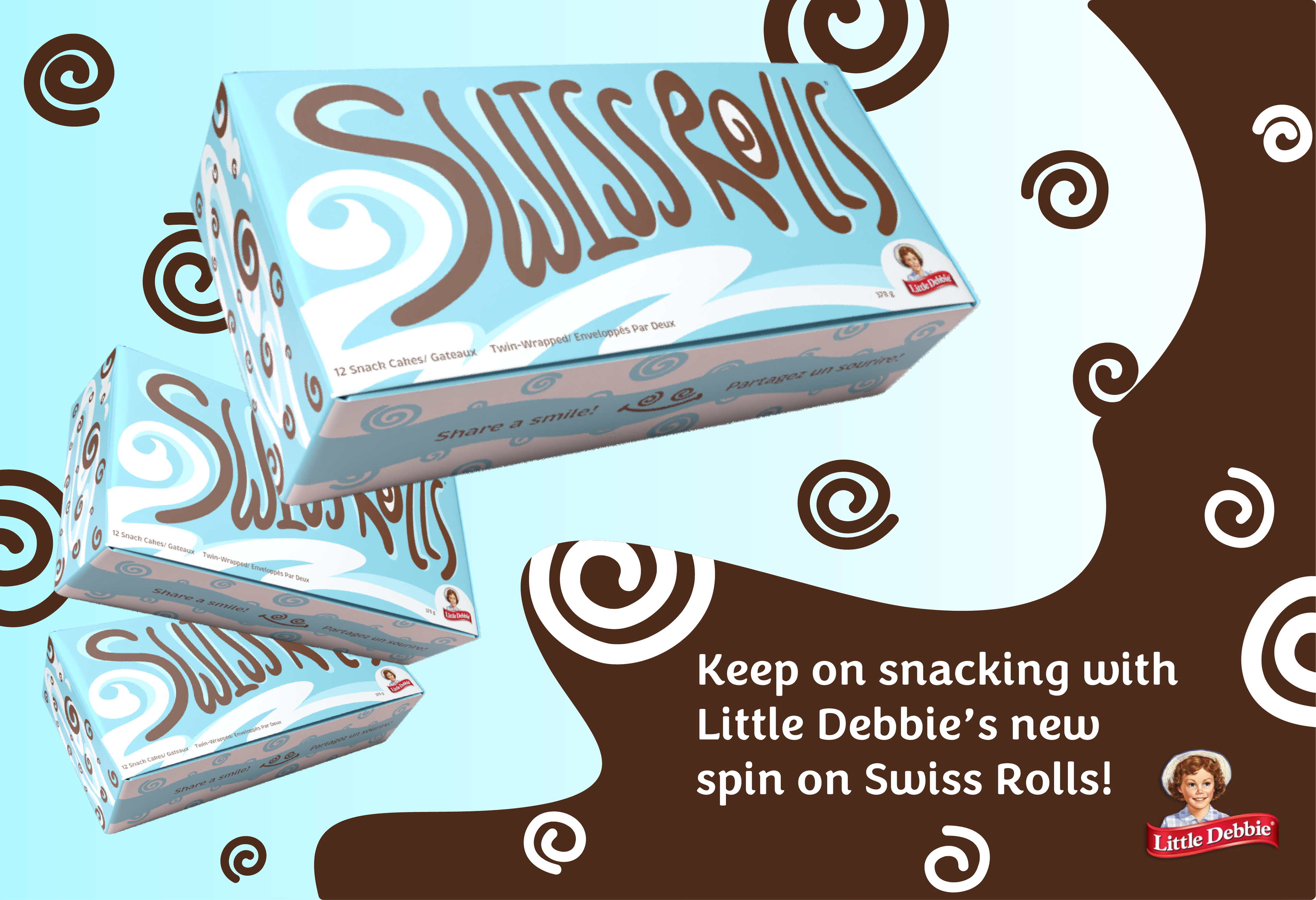
Rebrand advertisement