
Branding element
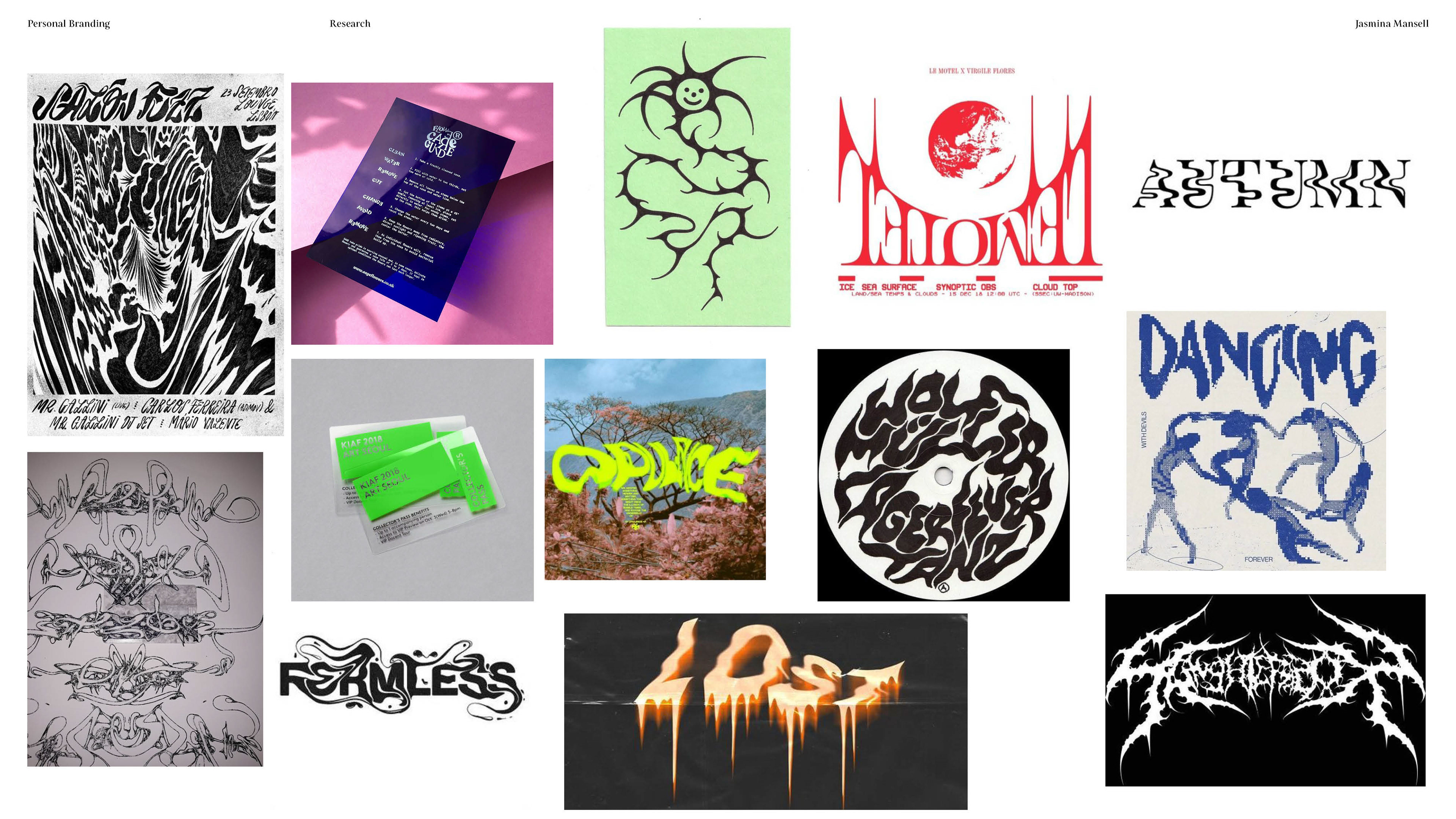
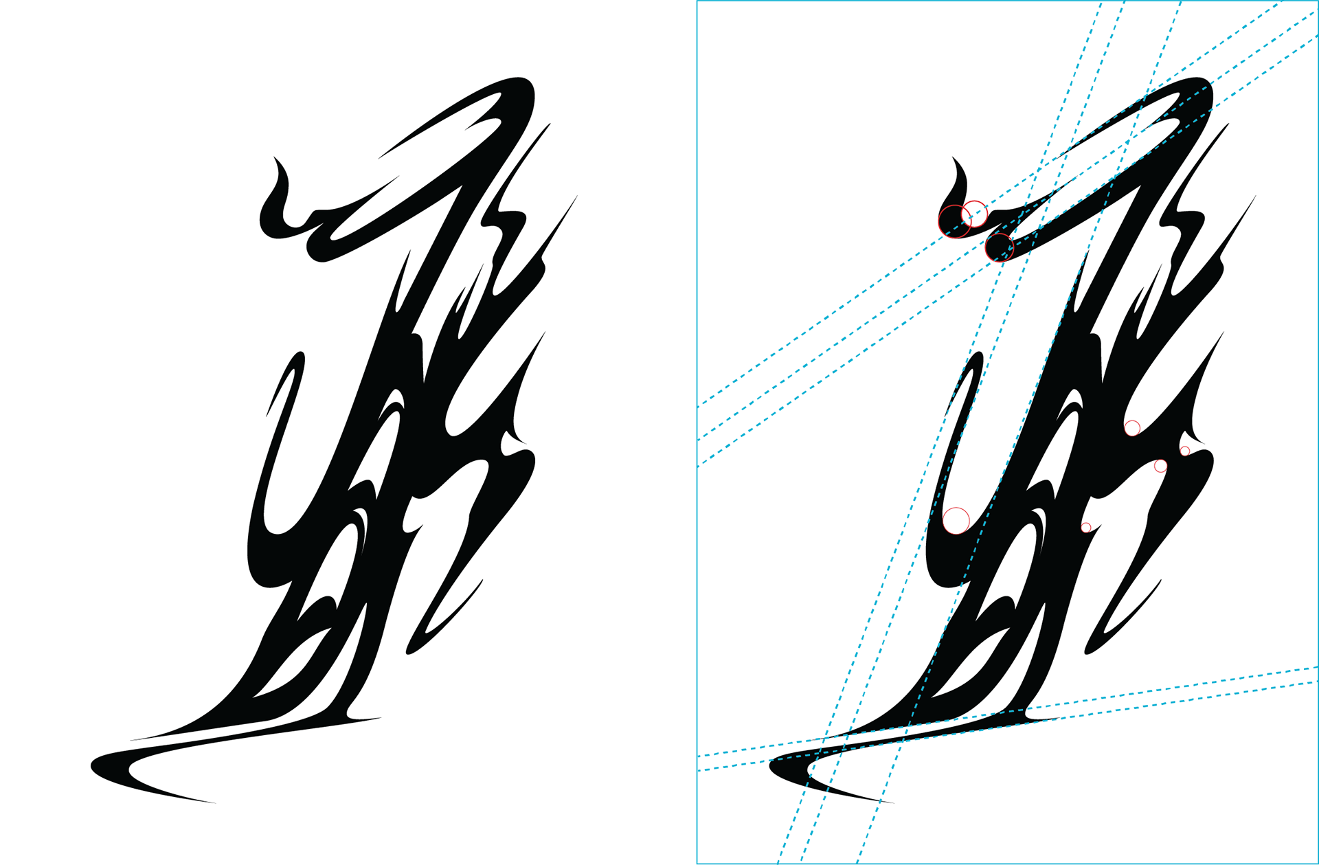
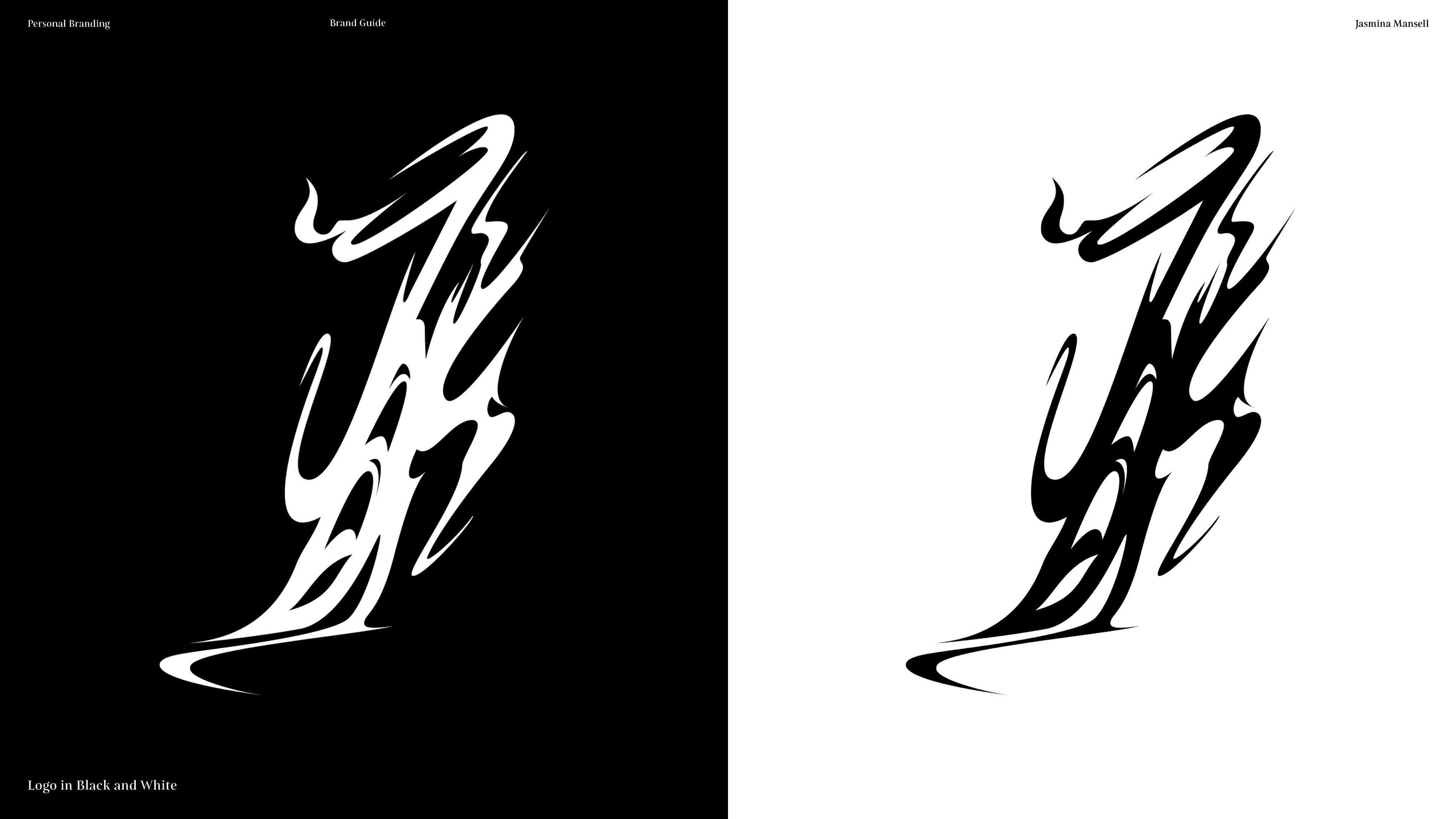
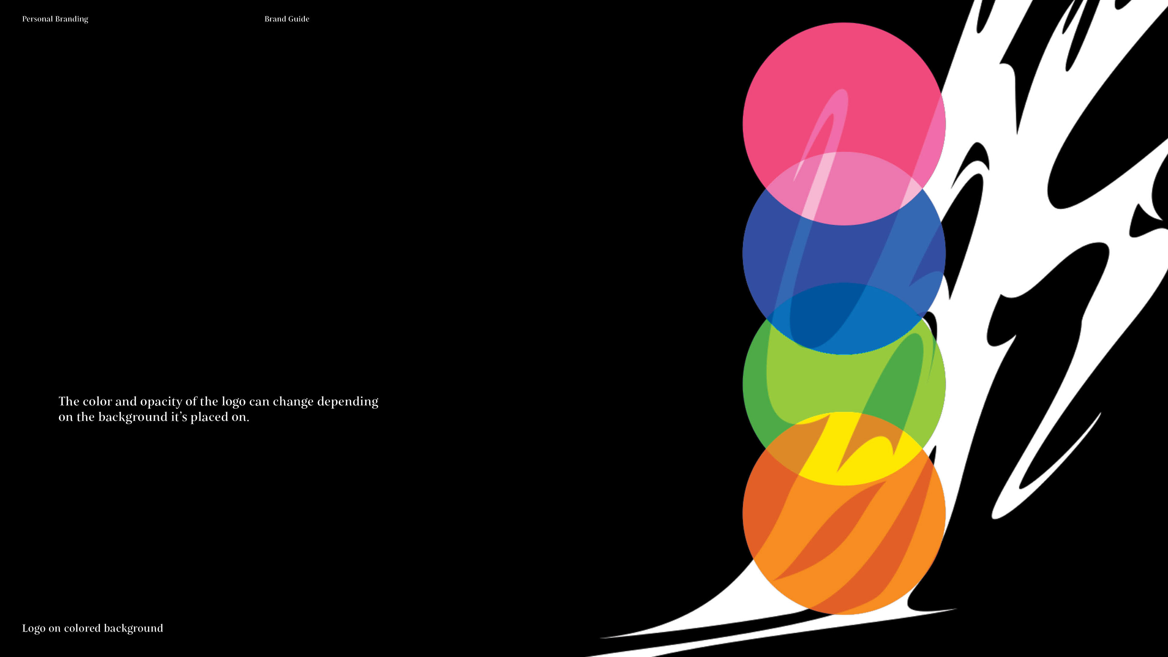
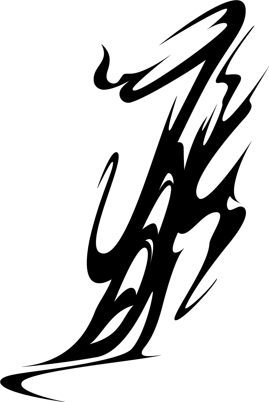
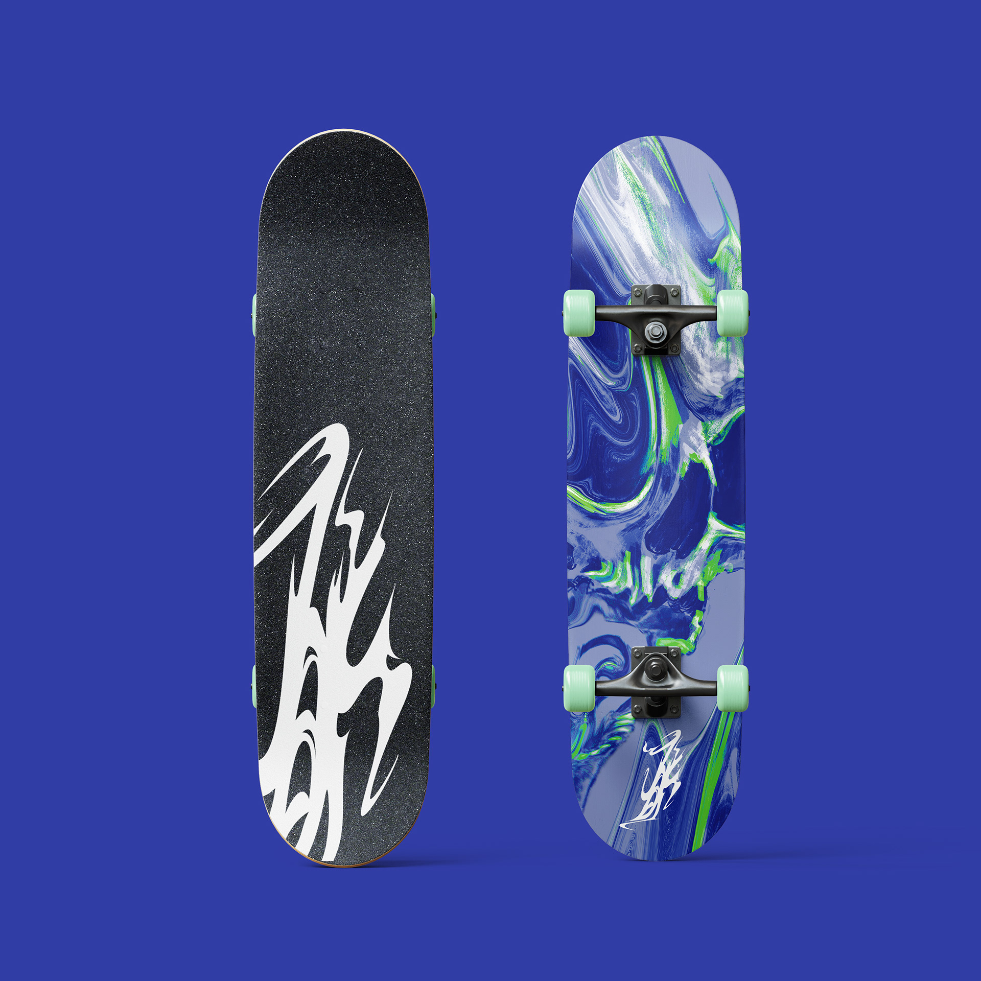
My main direction with this logo and branding was to represent the more edgy quality and subject matter of my illustrations. I also try to integrate a lot of interesting typography and text embellishments when I can so I wanted to play off of that and avoid a font-based logo. So in the end, I went with a concept based on heavy metal typography combined with chrometype shape language.